
Healthcare’s environmental blind spot
The CHNA platform built around environmental health.
Air quality, water contamination, toxic releases, and climate exposure are factors that contribute to community health outcomes. Banana Analytics overlays them with chronic disease prevalence, provider access, and social vulnerability across 3,222 counties and county equivalents in our dataset. A Public Benefit Corporation, built to put environmental health at the center of community health analysis.
Different counties, different priorities
Harris County, TX
Shelby County, TN
Humphreys County, TN
San Augustine County, TX
Try it before signing up
Explore your county.
Pick your state and county to explore environmental risk, disease burden, provider supply, and social conditions. Sign up free to open the county dashboard. No credit card.
Pick your state and county
See how environmental risk, disease burden, and provider access converge, in ten seconds.
See it in action
Watch the CHNA data workflow in 5 minutes.
From hospital service area to scored cohort to AI-drafted narrative. The full Banana Analytics workflow in one walkthrough.
What you get
Community health data with environmental context.
Bring demographic, health, workforce, and social indicators together with information about air, water, industrial releases, and climate hazards. Use them to inform your assessment alongside community input and local evidence.
The conventional CHNA dimensions
Core data for community health planning.
- Demographics and population profile
- Modeled health measures (CDC PLACES)
- Cause-specific mortality (CDC WONDER)
- Cancer incidence (NCI State Cancer Profiles)
- Provider supply and shortages (CMS NPPES, HRSA)
- Social determinants of health (Census ACS, County Health Rankings)
The environmental layer
Environmental conditions alongside health outcomes.
- Air quality (PM2.5, ozone, wildfire smoke)
- Drinking-water compliance indicators
- Toxic releases (EPA TRI)
- PFAS monitoring results (EPA UCMR5) and water compliance (ECHO)
- Hazardous-site proximity and older-housing indicators (EPA EJSCREEN)
- Climate hazards (heat, wildfire, flood)
- Industrial releases and agricultural indicators, available for comparison with health and social conditions
The Blind Spot
Put environmental conditions in the picture.
What environmental conditions deserve attention in your community?
Explore air quality, water monitoring, and hazardous-site indicators alongside health measures. Coverage varies by source and location; a missing measurement is not evidence of low exposure.
Where do environmental concerns and health needs overlap?
Compound signals flag combinations of elevated indicators for further investigation. A geographic overlap can help frame questions, but does not establish the cause of illness.
Which service needs warrant a closer look?
Service line scores organize health, provider, environmental, and social indicators to support planning. Interpret them alongside local capacity, community priorities, and the underlying measures.
The Platform
From Raw Data to Ready Intelligence
Explore county profiles across four dimensions, with scores where data is available. Paid plans add comparison tools, tract views, service line analysis, and report exports.
Environmental Risk
The published methodology combines selected air, PFAS, radon, pesticide-use, and heat indicators. Superfund proximity and other displayed measures are not all included in this score.
Disease Burden
A composite of selected CDC PLACES modeled health measures. Registry cancer incidence and CDC mortality are displayed separately and do not contribute to this score.
Provider Gap
A relative measure based on registered provider density, with a neighboring-county adjustment where available. Provider counts do not measure appointment availability or capacity.
SDOH Stress
A relative summary of social indicators covering food, housing, transportation, economic conditions, safety, behavioral health, and provider access.
County pages display more indicators than the scores use. Missing data changes the information available for scoring, and a low score does not establish low exposure. Review the underlying measures, source dates, and methodology when comparing counties.
Compound Signals
Explore combinations of environmental, health, and social indicators, including respiratory, wildfire smoke, heat, and industrial signals. Review coverage and confidence alongside each result.
Service Line Opportunities
Compare available indicators for respiratory, cardiovascular, oncology, renal, endocrine, and behavioral health planning. Scores help identify questions for local review.
Sub-County Intelligence
Explore Census tract views using available EPA EJSCREEN and CDC PLACES data, plus wildfire perimeter overlays. Geographic and indicator coverage vary by source.
Start free. Add analysis tools with Pro.
The free dashboard includes Environmental Factors, Health Outcomes, and Social Determinants, with up to two counties selected. Pro adds broader comparisons, compound signals, service line analysis, tract views, and report exports. AI narrative and cohort summary tools are available with Studio.
See exactly what you get
Explore county health indicators with a free account.
The free tier includes Environmental Factors, Health Outcomes, and Social Determinants. The examples below also show Compound Signals and Service Line Opportunities, which require Pro. Available measures vary by county.
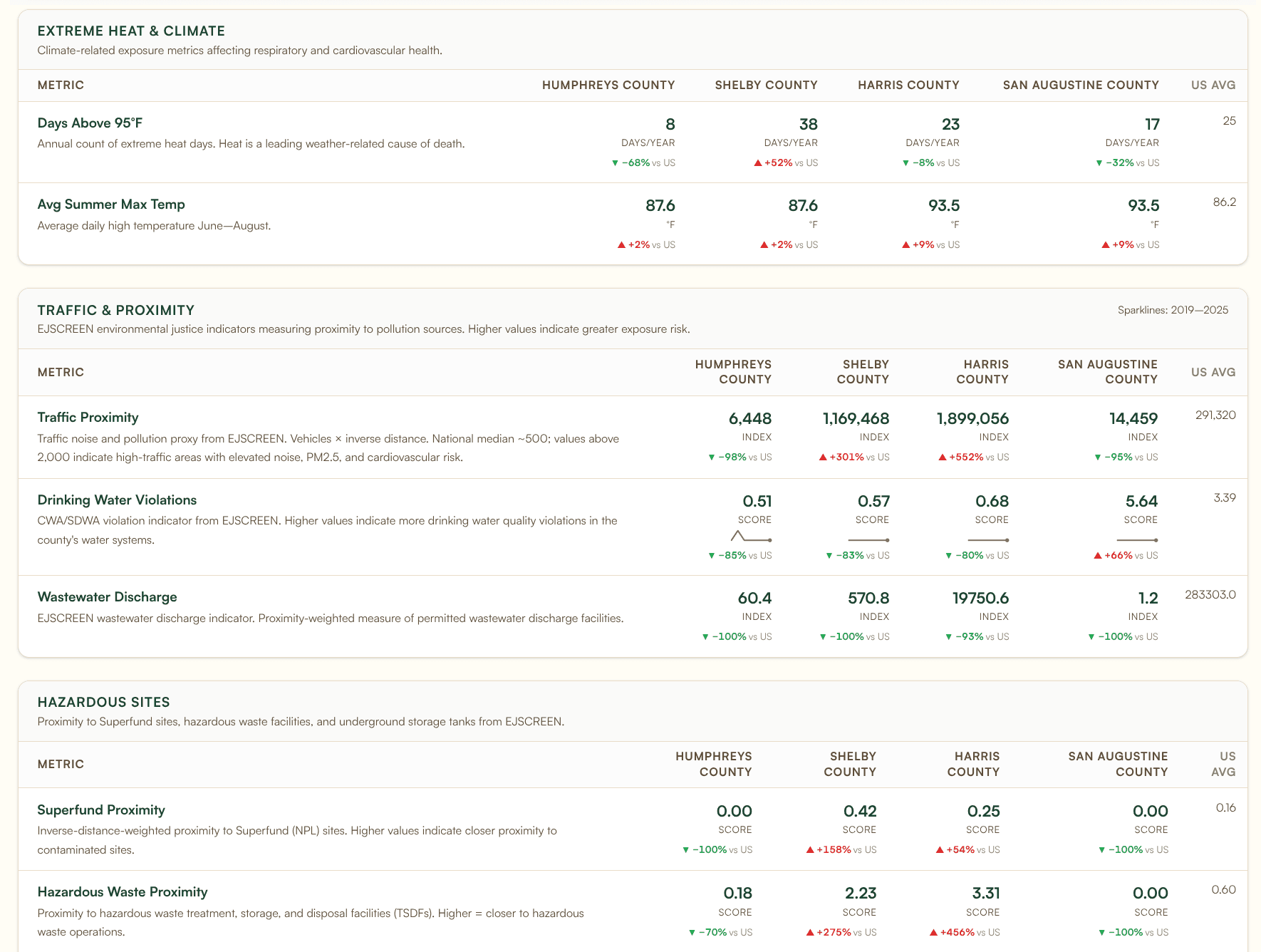
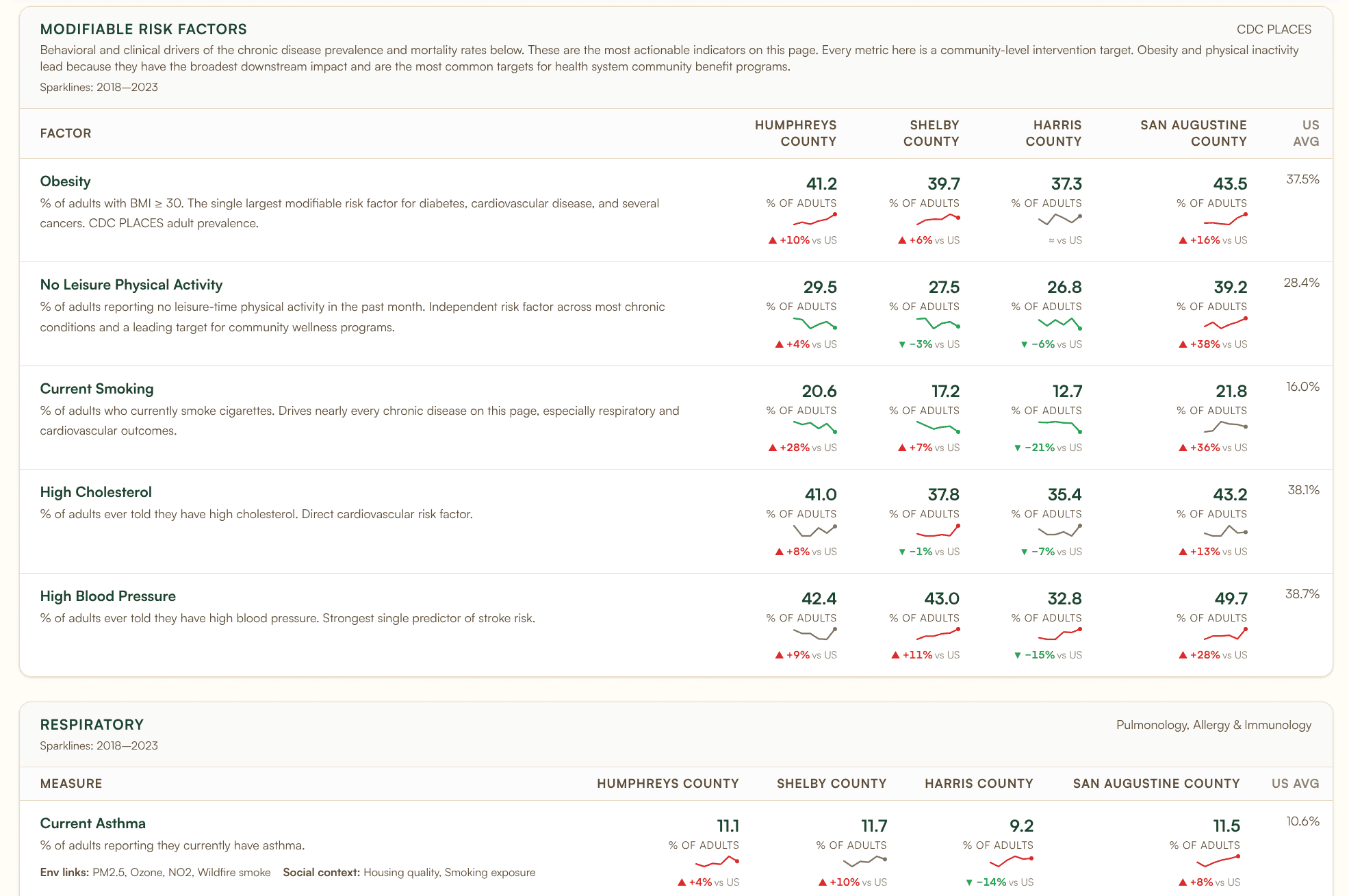
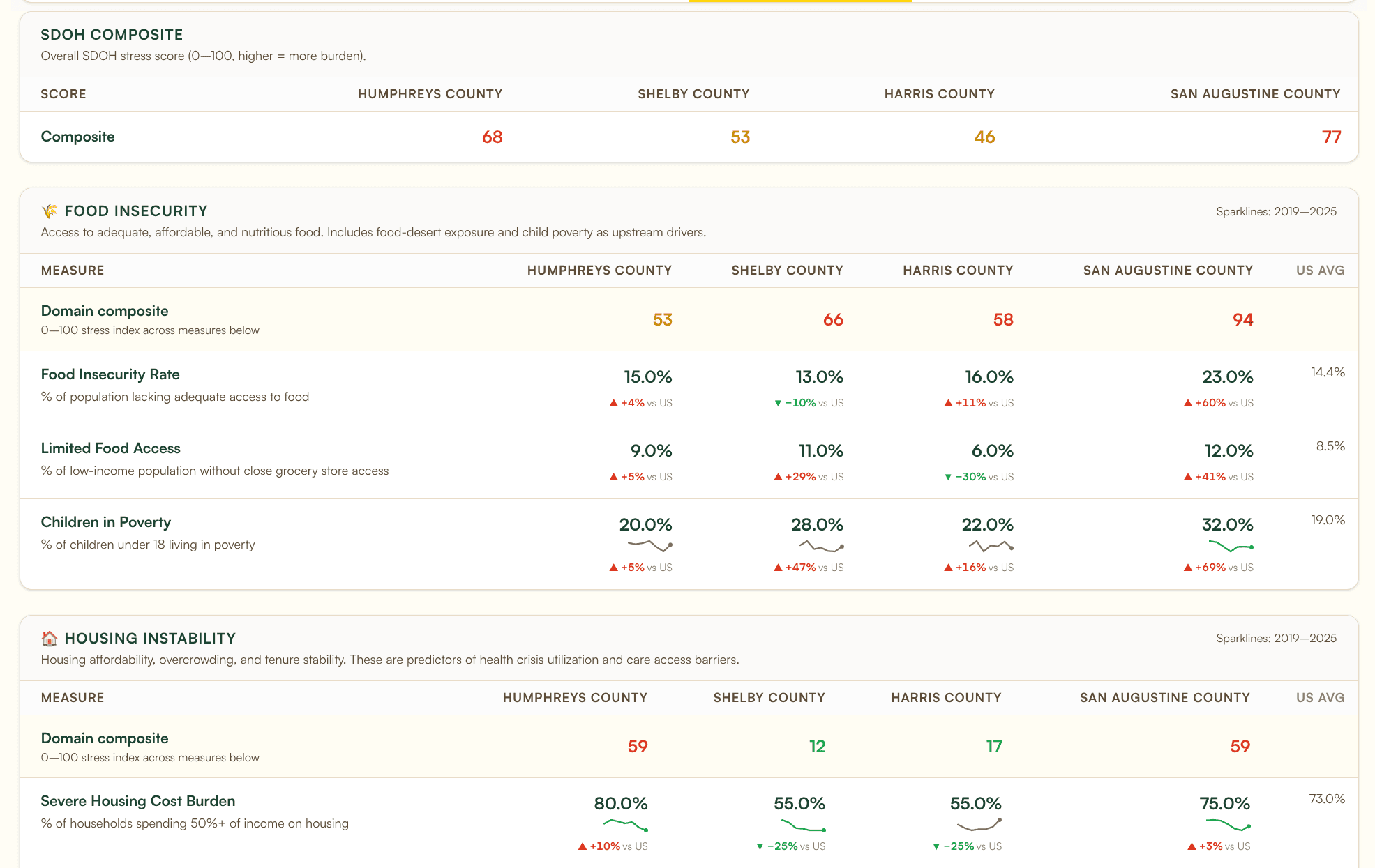
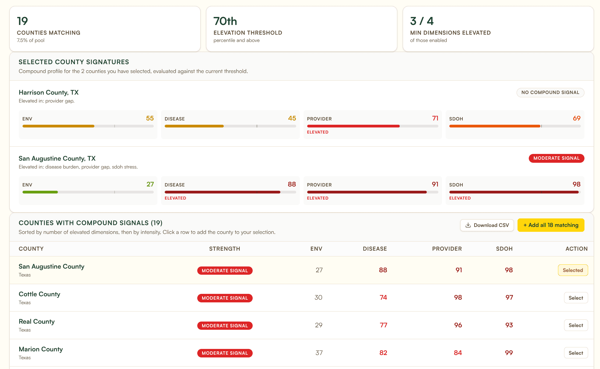
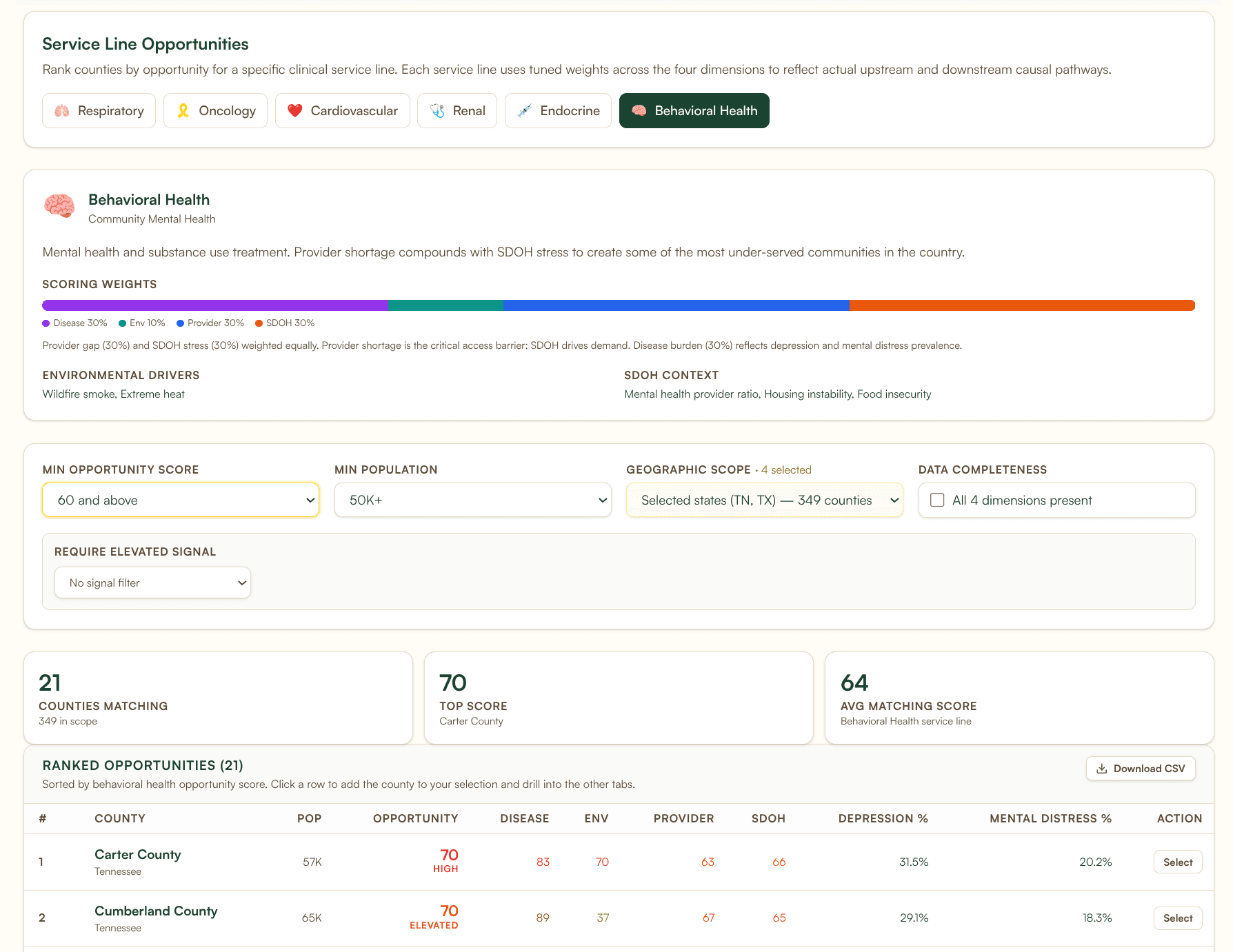
Note: the free subscription allows comparison of up to 2 counties side by side. The screenshots above show 4-county comparisons (a Pro view) so each dashboard has more to render.
The Consultant Studio tier
AI-drafted narratives with automated verification.
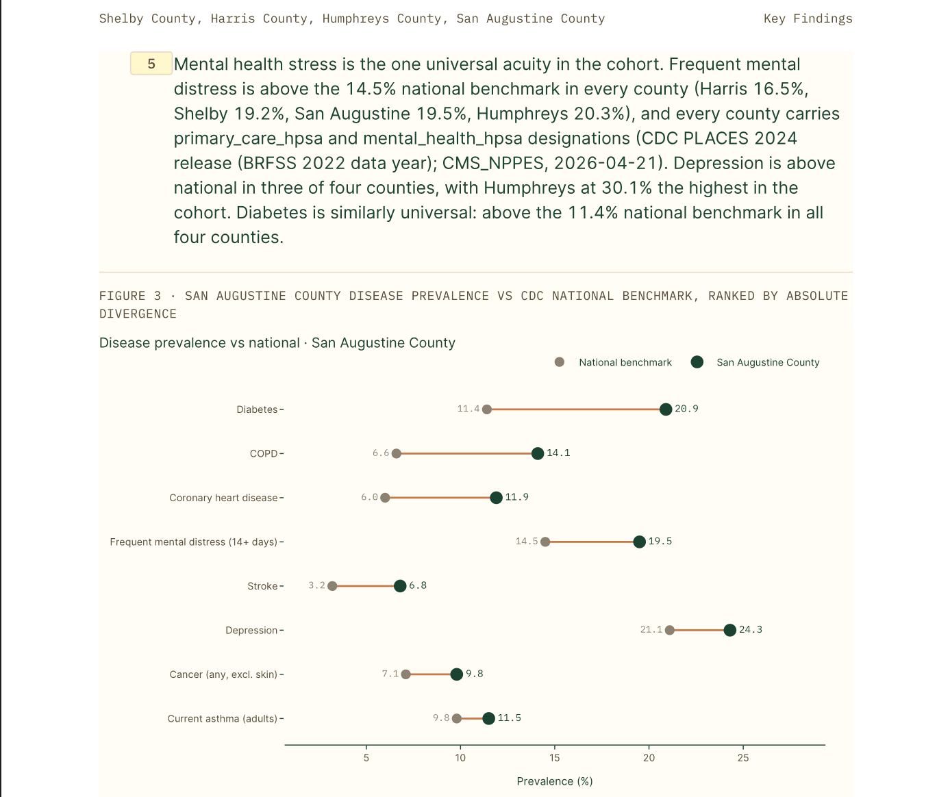
Choose a cohort and a reporting preset to generate a PDF with an executive summary, key findings, and charts. A separate verification step checks AI-drafted claims against the supplied report data. Generation time varies with report size. Review the output and its sources before using it in a CHNA or grant application; automated checks do not replace professional review or validate the source datasets themselves.
Explore overlapping indicators
Compound signals: where multiple risks converge.
Identify counties where selected environmental, health, provider, and social indicators are elevated together. Adjust thresholds and dimension counts, or explore named signals such as respiratory burden, wildfire smoke, heat, and industrial pollution.
Built for CHNA consultants
Build your service area, not someone else's.
County boundaries are administrative. Hospital catchments, member attribution, and grant-funded service areas are not. Define a cohort the way your engagement actually scopes it, then explore the available indicators and supported analyses for that footprint.
Method 1
ZIP list
Paste a list of ZIPs you already use to scope a CHNA or CB report. Resolves to tract resolution under the hood.
Method 2
Attribution CSV
Upload aggregate counts by ZIP using the supported template. Column validation checks the file structure; do not include patient identifiers.
Method 3
Drive-time isochrone
Define an area using estimated driving time from a facility, then review the geographic units included.
Method 4
Whole-state boundary
Select a state boundary for an assessment that covers the whole state.
Why We Exist
Making public data easier to use together.
Banana Analytics was founded by a registered nurse who spent over a decade building reporting infrastructure at academic medical centers and safety-net health systems. The realization that drove everything: the environmental and community health data already exists across federal agencies. Bringing it together can help the people making decisions on the ground.
Banana Analytics is a Public Benefit Corporation because the gap between environmental conditions and health outcomes is too important to leave to market incentives alone. Revenue funds our existence and drives innovation. We keep as much of the platform accessible as possible because the mission is in our articles of incorporation, not treated as a marketing afterthought.
Bedside Perspective
Founded by a registered nurse with experience in healthcare reporting and data infrastructure.
Engineering Rigor
Automated pipelines bring together public datasets with different release schedules. Source dates and coverage matter when interpreting results.
Public Benefit Corporation
Mission is in the articles of incorporation, not a marketing afterthought. Legally embedded.
1% for the Planet Member
One percent of gross revenue to environmental organizations, every year, regardless of profitability.
Every county has a story. Yours is one search away.
Explore 3,222 county and county-equivalent profiles. Start with a free account. No credit card.
Sign up free