568 US counties score at or above 70 on our Heat Health Risk signal: the top 18% nationally. They sit in the part of the country where summer temperatures are highest, cardiovascular and metabolic disease prevalence is most elevated, and specialty provider supply is thinnest. The headline finding from this analysis is that elevated heat-risk counties consistently have fewer cardiologists per capita than similar-sized counties anywhere else in the country, with the gap running from rural counties of 5,000 residents through major metros of multiple millions. The largest gap is not in small rural counties. It is in the metros.
That last sentence cuts against the prior most readers will bring to a heat health story. Heat vulnerability is usually told as a rural problem (small populations, limited services, isolation). The cardiology data tells a different story. The 14 elevated Heat Health Risk counties with populations over 150,000 have, on average, 25% fewer cardiologists per capita than their same-size national peers (9.75 per 100,000 versus 13.04 per 100,000). The 5k to 15k stratum runs 21% short. The 50k to 150k stratum runs 19% short. The gap is structural at every population class above 5,000 residents.
Mortality data lines up with the signal. Counties scoring at or above 70 on Heat Health Risk carry 21% higher heart disease mortality and 20% higher chronic lower respiratory disease mortality than the national average across the 2010 to 2024 period. Those are exactly the chronic disease groups the signal was designed to flag for heat compounding.
We are publishing this in late April for a specific reason. The National Weather Service has zero active heat advisories anywhere in the country today. By July, that will not be true, and the counties at the top of this list will be the ones absorbing the consequences first.
What the Heat Health Risk signal measures
The signal is a weighted blend of three components, each percentile-ranked nationally on a 0 to 100 scale.
The first is summer maximum temperature, drawn from NOAA's Climate at a Glance dataset. This contributes 40% of the score. The input is the average summer maximum daily temperature for the most recent calendar year, aggregated to NOAA climate divisions.
The second is chronic disease burden, contributing 30%. The input is a blend of coronary heart disease prevalence (60% weight) and diabetes prevalence (40% weight), drawn from the most recent CDC PLACES release. These two conditions were chosen because both are independently associated with heat-related morbidity and mortality. People with cardiovascular disease are more likely to suffer cardiac events during heat waves. People with diabetes have impaired thermoregulation and dehydration risk.
The third is provider access deficit, contributing 30%. The input is cardiologist density per 100,000 population, drawn from the CMS National Plan and Provider Enumeration System (NPPES) snapshot, with a fallback to total provider density when cardiology data is unavailable. The deficit score is adjacency-adjusted, meaning we account for whether a county's neighbors have specialty supply that residents could plausibly access, before flagging the county itself as a desert.
The signal then takes a weight-normalized average of present components. Counties with all three inputs are flagged as “high confidence.” Counties with two of three are “medium.” Counties with only one are “low.” A county can score above 70 on the basis of two strong components even when the third is missing. We document confidence levels in the underlying data because the reader of a CHNA or service-line analysis should know which counties are flagged with full evidence and which are flagged on partial inputs.
The full methodology is documented at banana-analytics.com/methodology.
A few honest caveats before going further.
The temperature input is climate-division-aggregated. NOAA assigns a single summer maximum temperature value to each of its multi-county climate divisions, which means counties in the same division share an identical temperature score. A reader looking at our top five counties will notice that all five have the same temperature component score. Variation in their final Heat Health Risk scores comes from the disease burden component, not the temperature component.
The signal does not include humidity or wet-bulb temperature. A 95°F day in Mobile, Alabama is physiologically more dangerous than a 100°F day in Phoenix because of the humidity differential. The current signal treats them as equivalent, or actually favors Phoenix because of the higher dry-bulb maximum (the ambient air temperature reading you would see on a standard thermometer, without accounting for humidity). This means we likely understate risk along the Gulf Coast and overstate it in the high desert. We are working on a humidity-adjusted version.
The signal also does not include emergency department surge capacity, cooling shelter availability, electric grid reliability, or housing air conditioning penetration. Those are inputs we want to add. More on that at the end.
Where the elevated counties concentrate
The geographic pattern has two parts.
Texas dominates the top of the distribution. 26 of the top 30 counties nationally are in Texas, almost all of them small rural West Texas and South Texas counties. Jeff Davis County leads at 97.2. Jim Hogg, Edwards, Foard, Loving, and Real all score above 95. These are sparsely populated counties hitting all three components: NOAA assigns them to climate divisions with high summer maximum temperatures, they carry cardiovascular and diabetes prevalence well above the national mean, and they have effectively no specialty provider supply.
The non-Texas pattern is the more interesting finding. Among the top 20 elevated counties outside Texas, the geographic clustering is remarkably tight: Mississippi (9), Arkansas (6), Oklahoma (4), and Florida Municipio, Puerto Rico. The three mainland states all sit in the South-Central rural region. The Mississippi Delta, the Arkansas Ozarks, and the Oklahoma Choctaw country produce a heat health risk band that runs continuously from the Texas border up through the Mid-South. Florida Municipio is a Caribbean outlier flagged on a partial input set (Puerto Rico's coverage is sparser than the mainland in our data sources), and we treat its score with appropriate uncertainty.
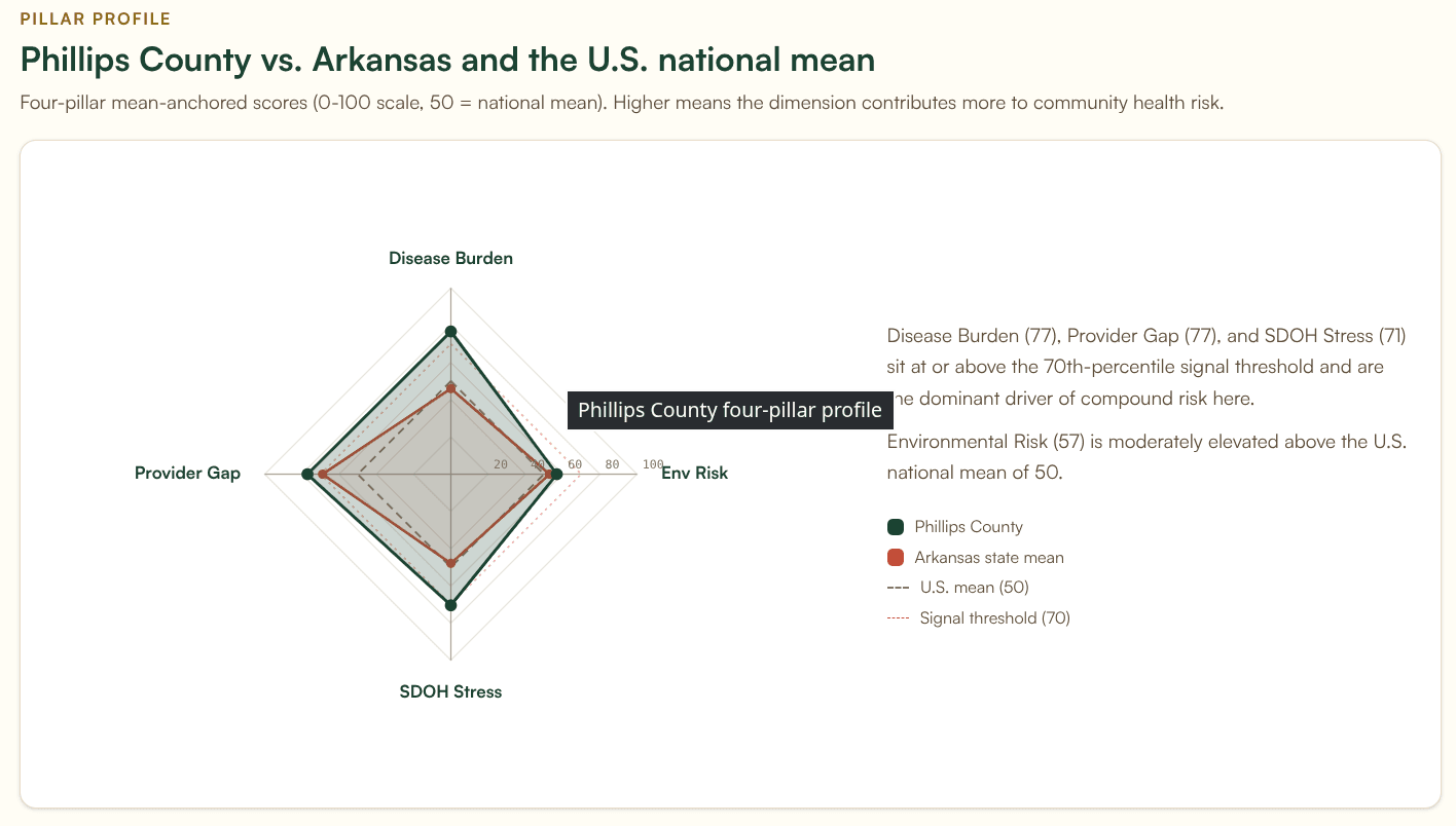
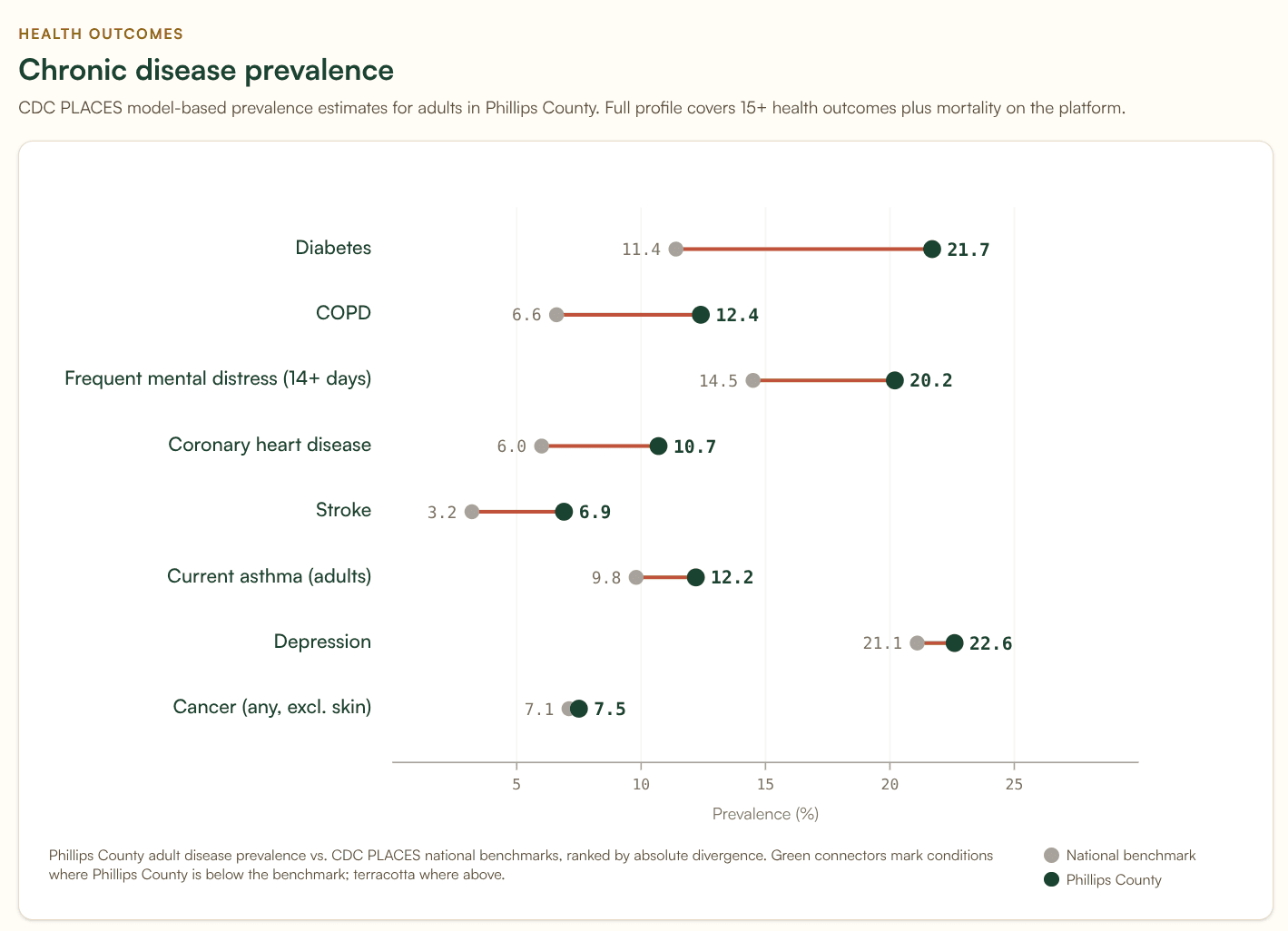
The non-Texas top three are Amite County, Mississippi (92.0), Sharkey County, Mississippi (91.7), and Phillips County, Arkansas (91.5). These are not the counties that drive most CHNA-data conversations. They are small (3,800 to 16,000 residents), rural, and in several cases majority Black: four of the non-Texas top 20, all in the Mississippi and Arkansas Delta band, are majority Black. The full non-Texas top 20 has a median population of 12,400 and a median elderly population share of 21%.
The combined picture is a Texas concentration plus a Mississippi Delta and South-Central rural belt. If you map elevated Heat Health Risk counties at the national level, those two patterns explain most of the distribution. The Northeast and Pacific Northwest are essentially absent. The Southwest shows scattered elevated counties driven primarily by elderly demographics rather than chronic disease.
The cardiology gap, controlling for population
It would be easy to look at the 568 elevated Heat Health Risk counties, count cardiologists, and report a dramatic-sounding statistic. 67% of them are in the bottom national quartile for cardiologist density. The smallest of them have no cardiologist on file at all. Both numbers are true. Both numbers are also misleading on their own.
The reason is that small-population counties almost never have a cardiologist regardless of heat risk. A county of 3,000 people cannot economically support a cardiologist, no matter what the heat exposure or disease burden looks like. Reporting “no cardiologist” in that context conflates a structural fact about county size with a finding about heat-vulnerable counties specifically.
The honest version of this analysis stratifies by population and asks: at each county-size class, do elevated Heat Health Risk counties have fewer cardiologists than their similarly-sized national peers? The answer is yes, at every population class above 5,000 residents.
| Population stratum | Elevated counties | Mean cardio /100k (elevated) | Mean cardio /100k (same-size national) | Gap |
|---|---|---|---|---|
| 5,000 to 15,000 | 164 | 9.14 | 11.50 | −21% |
| 15,000 to 50,000 | 239 | 9.78 | 11.45 | −15% |
| 50,000 to 150,000 | 66 | 9.81 | 12.06 | −19% |
| Over 150,000 | 14 | 9.75 | 13.04 | −25% |
Three things in this table are worth pulling out.
First, the gap holds at every population class above 5,000 residents. This is not an artifact of including tiny rural counties. A 30,000-resident county in the elevated heat-risk set has measurably fewer cardiologists per capita than a typical 30,000-resident county elsewhere in the country.
Second, the largest gap is in the metros. The 14 elevated Heat Health Risk counties with populations over 150,000 carry 25% fewer cardiologists per capita than their same-size peers. This was not what we expected to find. Heat vulnerability stories usually skew rural, and rural is where the population-counts framing pushes attention. The data says metros are the place where the relative shortfall is largest.
Third, the gap survives adjacency adjustment. The Heat Health Risk signal already accounts for cardiology supply in neighboring counties, on the theory that residents can drive 30 minutes for specialty care. Even after that adjustment, the elevated metros still run 25% behind their same-size peers. Their neighbors are not closing the gap.
For the smallest counties, populations below 5,000, we are honest that the cardiology framing breaks down. 100% of elevated heat-risk counties under 5,000 residents have zero cardiologists, but so do the overwhelming majority of all sub-5,000 counties nationally regardless of heat exposure. At that size, “no cardiologist” is a structural fact about American rural healthcare, not a finding about heat vulnerability.
The provider deficit extends beyond cardiology. 565 of the 568 elevated counties (99%) are either in the bottom national quartile for primary care physician density or carry an active HRSA Primary Care Health Professional Shortage Area designation. 293 (52%) are also in the bottom quartile for pulmonologist density. The picture is not one cardiology gap. It is a stack of provider deserts overlapping with the same heat exposure and disease burden footprint.
For health systems looking at heat-vulnerable service areas, this is a service-line gap analysis hiding in plain sight. The places with the highest heat-driven cardiovascular risk are the same places where a cardiology outreach clinic, a tele-cardiology partnership, or a regional hub-and-spoke arrangement would address the largest underserved population. The Service Line Opportunities tab in the Banana Analytics platform surfaces this for any cohort a user constructs.
What the mortality data shows
Mortality validation across the 2010 to 2024 CDC WONDER 5-year aggregate is the strongest evidence the signal is identifying real risk.
Counties scoring at or above 70 on Heat Health Risk carry, on average:
- 15.6% higher all-cause mortality than the national average (1,467 vs 1,270 per 100,000)
- 21.0% higher heart disease mortality (335 vs 277 per 100,000)
- 20.1% higher chronic lower respiratory disease mortality (86.1 vs 71.7 per 100,000)
- 16.2% higher stroke mortality (68.4 vs 58.8 per 100,000)
- 8.2% higher cancer mortality (255 vs 236 per 100,000)
The pattern is informative. The largest excess mortality gaps are in heart disease, CLRD, and stroke: exactly the chronic disease groups the signal was designed to flag for heat compounding. Cancer mortality, which is not directly heat-mediated, shows the smallest excess. If the signal were simply identifying poor counties with poor health, we would expect cancer mortality to be elevated by similar margins. It is not.
A caveat worth stating plainly: this is correlation across a 15-year period, not attribution to heat events. Heat-specific mortality codes (ICD-10 X30 for exposure to excessive natural heat, T67 for effects of heat and light) are not currently in our pipeline. We use cardiovascular and respiratory mortality as the closest available proxy. A future iteration of this analysis will pull X30 and T67 directly from CDC WONDER. We expect those counts to be small in absolute terms (heat-specific mortality is notoriously underreported and CDC suppresses small counts for confidentiality), but their geographic distribution will tell us whether the proxy excess is conservative or generous.
Three counties worth a closer look
The data surfaces several counties that illustrate the pattern in different ways.
Phillips County, Arkansas sits in the Mississippi Delta with a Heat Health Risk score of 91.5. Only two non-Texas counties (both in Mississippi) score higher. Population 15,910, with a poverty rate of 28.7% and a 20% elderly population share. The county scores high on all four dimensions (environmental risk 56.9, disease burden 76.7, provider gap 77.0, social and economic stress 93.4). It is also a clean test of the population-stratified finding: in its 15k to 50k population class, where the national mean is 11.45 cardiologists per 100,000, Phillips sits at 6.29. That puts the county in the 3rd percentile within its own size class. Even after adjacency adjustment, accounting for any specialty supply in surrounding counties, Phillips moves only to the 8th percentile. The gap is not a population artifact. It is a service-line gap a cardiology partnership could close.
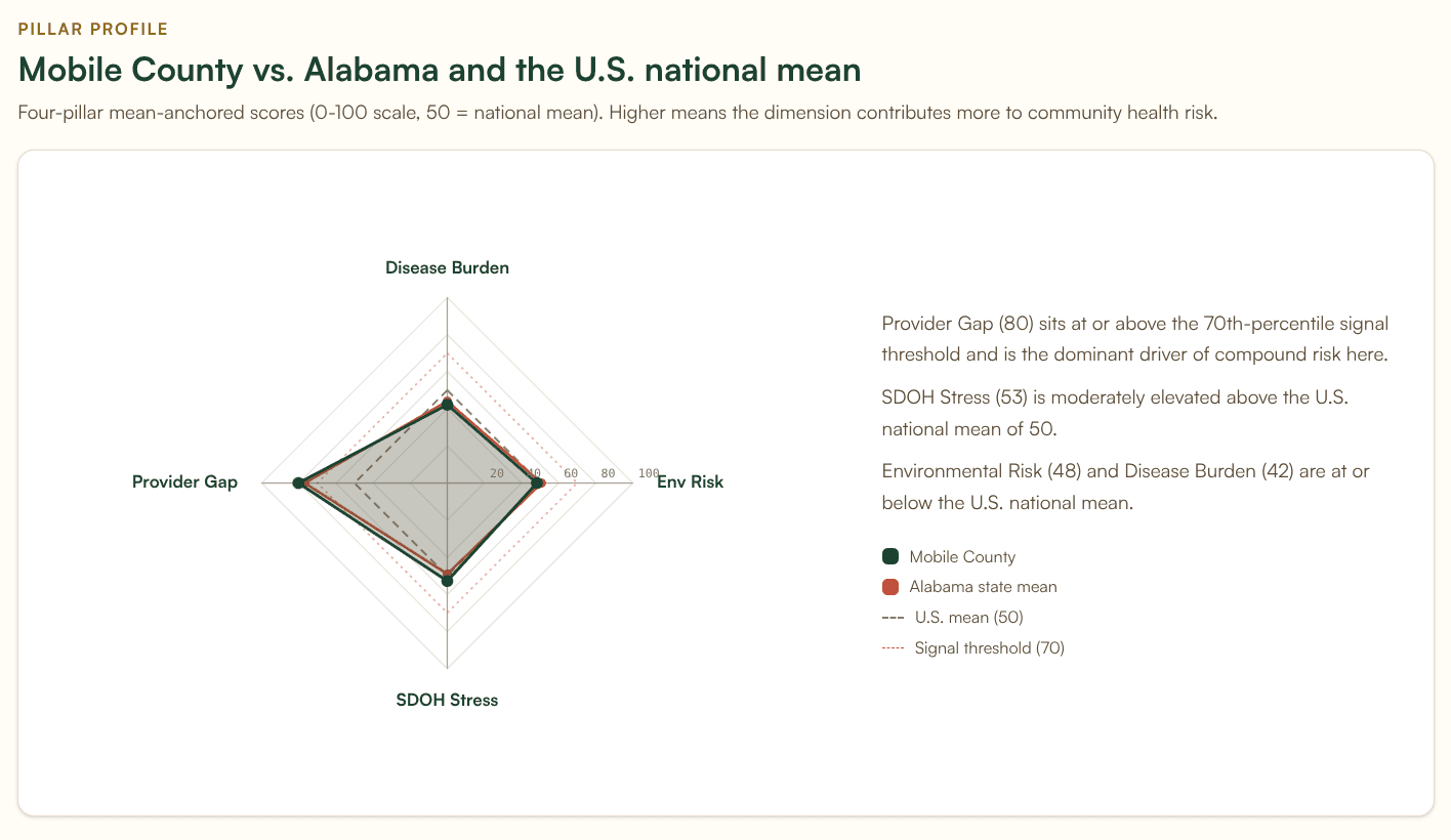
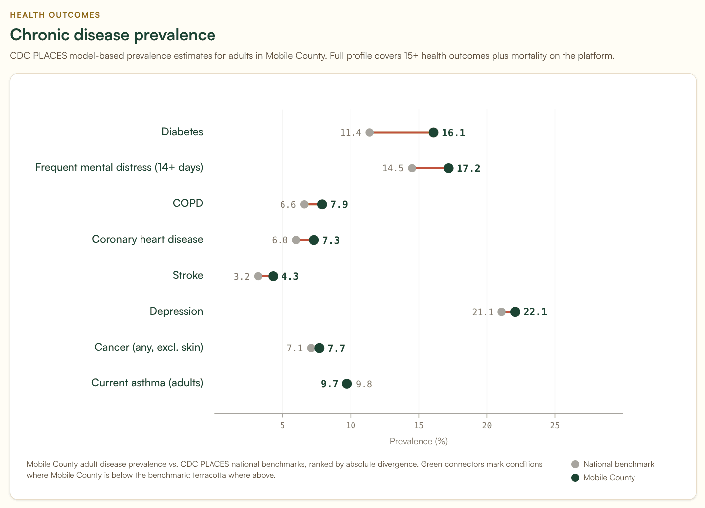
Mobile County, Alabama is the urban Gulf Coast case at 70.8 and the cleanest illustration of the metro finding. Population 413,162, with 70,108 residents age 65 or older, the largest absolute count of elderly residents in any non-Texas elevated heat county. Mobile sits at 9.92 cardiologists per 100,000 against an over-150k national mean of 13.04. That is the 18th percentile within its size class, and adjacency adjustment moves it only marginally. Mobile is also the county where the humidity caveat bites hardest. The dry-bulb temperature input does not capture what makes a Gulf Coast summer dangerous. We expect Mobile's true heat risk to be higher than its current score.
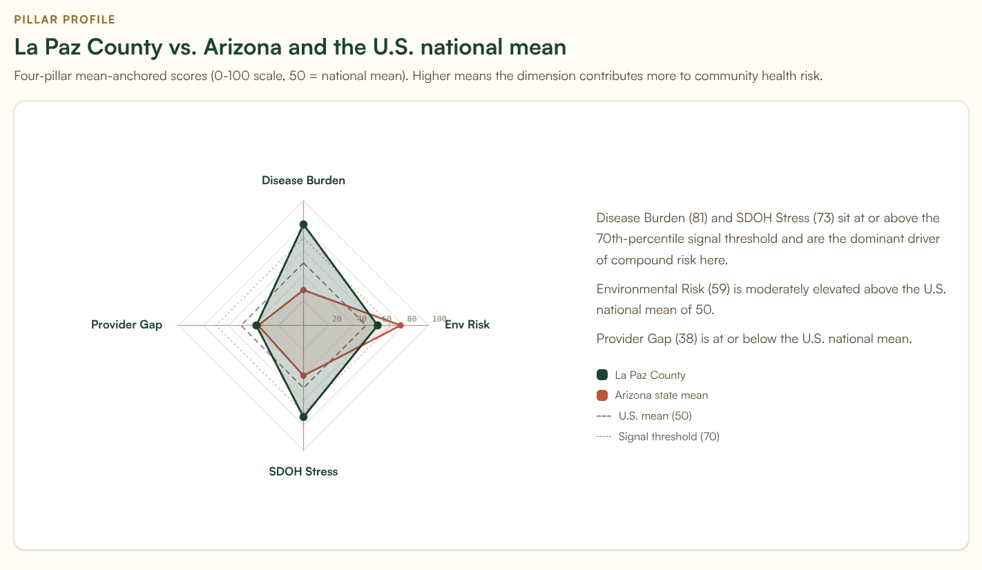
La Paz County, Arizona sits at 80.3 with a fundamentally different demographic story. The county sits at the Arizona-California border along the Colorado River, hosts a large snowbird and retiree population, and has a 42.2% elderly population share. La Paz is a useful counterexample to the cardiology framing: its cardiologist density is essentially at the national mean for its size class. The Heat Health Risk score is driven primarily by extreme summer temperature and the elderly population share, not by a provider gap. La Paz illustrates that the signal flags two distinct populations: counties where the gap is provider supply, and counties where the gap is demographic vulnerability. Heat preparedness for La Paz looks different from heat preparedness for Phillips. The signal flags both; the response should differ.
What the signal does not yet capture
We have already named the three internal caveats: climate-division temperature aggregation, no humidity input, no facility or grid resilience component.
The most important external gap is that this signal does not yet incorporate medical-equipment-dependent populations. The HHS emPOWER program publishes monthly county-level counts of Medicare beneficiaries dependent on electricity for medical equipment: oxygen concentrators, ventilators, dialysis pumps, IV infusion pumps, electric wheelchairs. Those people are at extreme risk during heat-driven power outages. A cardiology gap is dangerous. A cardiology gap in a county with 1,200 oxygen-dependent residents during an ERCOT load-shedding event is a different category of dangerous.
We are scoping a Heat-Outage-emPOWER compound signal that would blend the current Heat Health Risk score with emPOWER per-capita rates and grid stress indicators. The intent is to surface counties where a heat-driven outage would be both more likely (Heat Health Risk) and more dangerous (emPOWER concentration). If you work on heat preparedness, emergency medical services, or grid reliability and want input on what that signal should look like, reach out. We would rather build it with practitioner input than alone.
For practitioners
If you write CHNAs, the 568 elevated Heat Health Risk counties deserve a place in your secondary data review, particularly when the assessment area falls within or adjacent to the Texas concentration or the Mississippi Delta and South-Central rural belt. The population-stratified cardiology finding is the most useful framing we have found for translating heat exposure data into a service-line conversation a hospital board can act on. It also reframes the metro story: large urban counties at elevated heat risk are systematically under-resourced on cardiology relative to their size, and that is not a finding that surfaces from any standard CHNA tool we have seen.
If you work in health system strategy or community benefits, the Service Line Opportunities tab in the Banana Analytics platform surfaces cardiology, primary care, and pulmonology gaps for any cohort. The cohort can be a defined service area, an attribution file, or a drive-time isochrone. The same signal that identifies population vulnerability also identifies where a tele-cardiology investment, an outreach clinic, or a regional referral arrangement addresses the largest underserved population.
If you run a public health department, the geographic distribution of elevated Heat Health Risk counties is a starting point for cooling center prioritization, ED surge planning, and emPOWER outreach. The Banana Analytics platform is free at the county level for the basic profile and includes Heat Health Risk in the Compound Signals tab on Pro plans. We make data available without a procurement conversation when the work warrants it.