Texas has 129 compound signal counties, more than any other state and more than Mississippi and West Virginia combined. That count alone is the headline most people would write. We are going to write a different one.
The interesting finding is not that Texas has the most. It is that Texas has them in at least four geographically distinct regions, each with a different mix of drivers, each requiring a different community health response. Mississippi clusters in the Delta. West Virginia clusters in the southern coalfields. Texas does not cluster anywhere. The compound signal counties spread across East Texas, the Rio Grande Valley, the Hill Country, and the Panhandle, and the four regional patterns share a state but not much else.
For anyone preparing a community health needs assessment in Texas, this matters. The CHNA implementation strategies that work for the Piney Woods do not work for the Lower Rio Grande Valley. The disease burden patterns are different. The provider gaps are structurally different. The social determinants stack is different. Treating “Texas rural health” as one phenomenon flattens four real ones.
What the signal measures, applied to Texas
The Banana Analytics compound signal flags a county when two or more of the four pillars (Environmental Risk, Disease Burden, Provider Gap, Social and Economic Stress) sit at or above the 70th national percentile. Texas has 129 such counties of 254 total, or 50.8% of the state. By raw count this is the largest in the country. By concentration, Texas trails Mississippi (76.8%) and West Virginia (72.7%).
The dimension breakdown is the first place Texas distinguishes itself. Within those 129 compound signal counties:
- 99% score at or above the 70th percentile on Provider Gap (128 of 129)
- 95% score at or above on Social and Economic Stress (122 of 129)
- 12% score at or above on Disease Burden (16 of 129)
- 9% score at or above on Environmental Risk (11 of 129)
The signature pattern is Provider Gap plus Social and Economic Stress, structurally similar to the Mississippi and West Virginia patterns we have written about. The differences come in the secondary tails. Texas has a meaningful Disease Burden contingent and a smaller but real Environmental Risk contingent, both larger than the Mississippi pattern we documented previously, where the signal is almost purely Provider Gap and Social and Economic Stress. Those Environmental Risk-elevated counties cluster in the Brazos Valley and East Texas, driven by ozone, traffic proximity, and Toxic Release Inventory release intensity rather than air quality hotspots.
When community health practitioners ask whether the compound signal pattern in their region is a “rural happens to be poor” artifact, the average pillar scores answer that. For the 129 Texas signal counties, Provider Gap averages 86.6 and Social and Economic Stress averages 81.9, against a national mean of 50 in both. These are extreme tails, not poverty proxies. The full methodology is documented at banana-analytics.com/methodology.
A few caveats worth stating before walking through the regions.
Eight Texas counties have null Provider Gap scores (Borden, Kenedy, Kent, King, Loving, McMullen, Roberts, Terrell), all ultra-low-population frontier counties where the pipeline produces no provider density estimate when there are zero matched providers and zero adjacent supply. Loving County’s Disease Burden is also suppressed. We exclude these counties from claims that depend on those pillars.
The CDC PLACES data we use for Disease Burden is complete for Texas; the Kentucky and Pennsylvania gap that prompted our earlier article on PLACES data integrity does not affect Texas counties.
The pesticide_heat_farmworker named compound signal flags 247 of 254 Texas counties at the 70th percentile, but the underlying agricultural coverage data is currently incomplete and the signal carries low confidence statewide. We mention it where it adds context but do not lead with it.
Region 1: East Texas Piney Woods
A note on regional groupings: the four regional buckets used in this article (East Texas / Piney Woods, Rio Grande Valley / South Texas, Hill Country / Edwards Plateau and Trans-Pecos, Panhandle) are coarse geographic clusters drawn from latitude/longitude binning rather than standard administrative regions like Texas Council of Governments boundaries. Counties on regional edges (Brazos Valley counties, Trans-Pecos counties, North-Central counties) may sit between buckets. The clustering serves the article’s narrative purpose; a CHNA practitioner should verify regional assignment for their specific county against their organization’s working definitions.
The East Texas signal cluster is the strongest in the state and the most overlooked. 21 of the 31 East Texas counties (68%) carry the compound signal flag, and the top of the overall ranking is dominated by Piney Woods counties: San Augustine (75.1), Jasper (74.9), Sabine (74.6), Leon (73.8), Marion (73.7), Cass (73.1).
The pattern here is what the Black Belt looks like in Texas. High Social and Economic Stress (most counties at or above 90), high Provider Gap (most at or above 80), elevated Disease Burden, with Environmental Risk in the mid-50s to high-60s driven by traffic proximity, paper mill release inventories, and ozone transport. These counties are heavily forested, economically anchored to timber and oil-adjacent service work, and demographically older and poorer than the Texas average. Several are majority Black or have substantial Black populations. Median household income in San Augustine is $50,908 with 32% of children in poverty.
For a CHNA practitioner serving an East Texas community, the data tells a coherent implementation story. The dominant drivers are not environmental and not chronic-disease behavioral. They are structural: provider supply, social determinants, and the cumulative cost of long-term economic decline. Implementation strategies focused on cooling shelters or pollution reduction will not move outcomes here. Strategies focused on care navigation, telehealth specialty access, FQHC capacity, and food security will.
The practical opportunity is regional rather than county-by-county. Jasper, Cass, Marion, San Augustine, and Sabine sit within a 100-mile triangle. Among these five, the Banana Analytics platform identifies roughly 7,400 underserved primary care patients (defined as population scaled by the gap between local PCP density and the national 25th percentile). That is a single hub-and-spoke regional play with measurable population scale, not five county-level efforts.
San Augustine County is the cleanest exemplar. Population 7,833. Six named compound signals trigger at or above 70 simultaneously: respiratory burden, wildfire burden, heat health risk, heat dialysis vulnerability, pesticide-heat-farmworker, and CAFO-flood-uninsured-rural. A CHNA built around this county’s actual exposure profile looks different from one built around generic rural health framing.
Region 2: Rio Grande Valley and South Texas
14 of 22 South Texas counties (64%) carry the compound signal. The pattern is structurally different from East Texas, and one finding cuts against the dominant regional narrative.
Border counties are not the worst. Of the 14 Texas counties touching Mexico, the average opportunity score is 54.3, slightly below the Texas state average of 56.0. Seven of the 14 border counties carry the compound signal, but the pattern is driven almost entirely by Social and Economic Stress and Provider Gap. Disease Burden and Environmental Risk are middling. Hidalgo and Cameron, the two largest border MSAs, score 54.9 and 54.3 respectively. Real and present compound signal, but not extreme.
This matters for CHNA preparation because the lazy framing (“the border is the worst part of Texas”) does not survive the data. The structural Provider Gap and Social and Economic Stress are real, but they reflect the same patterns visible across South Texas more broadly, including non-border counties like Brooks, Jim Hogg, Duval, and Zapata. The border is part of a regional pattern, not the apex of it.
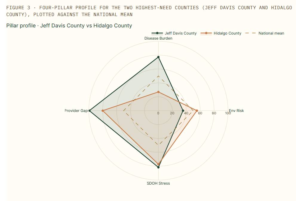
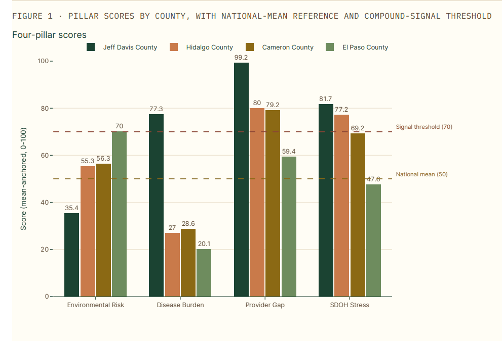
Hidalgo Countyis the metro outlier worth examining closely. Population 898,471, 92% Hispanic, with the McAllen-Edinburg-Mission MSA serving as the regional anchor. The county scores 54.9 on overall opportunity and triggers the canonical compound signal on Provider Gap (80.0) and Social and Economic Stress (77.2). What makes this notable is that Hidalgo has substantial health system infrastructure: Doctors Hospital at Renaissance, DHR Health, and the relatively new UTRGV School of Medicine. The infrastructure exists. The provider density and SDOH exposure still mark it as a compound signal county. This is the case study for the proposition that “we have a hospital here” is not the same as “this community is well-served.”
Cameron County tells a parallel story for the Brownsville-Harlingen MSA. Population 426,710, 36% of children in poverty, compound signal driven by Provider Gap (79.2) and Social and Economic Stress (69.2). Together, Hidalgo and Cameron represent roughly 1.3 million Texas residents living in MSAs that score as compound signal counties. CHNA collaboration across the Lower Rio Grande Valley is the relevant framing.
A caveat for Hidalgo and Cameron specifically: the provider density data captured in the platform is from CMS NPPES, which does not capture cross-border specialty care utilization. Some Lower Rio Grande Valley residents access specialty care in Reynosa, Matamoros, or further into Mexico. Cross-border health-care utilization volume is debated in the literature, but the score may slightly understate effective provider access for residents who do use it.
Region 3: Hill Country, Edwards Plateau, and Trans-Pecos
This is the region that overlapped most heavily with our heat health risk article last week. 17 of 34 Hill Country and Edwards Plateau counties (50%) carry the compound signal, and the heat health risk concentration is here. Of the top 30 nationally on heat health risk, 26 are in Texas, and most of the Texas heat counties sit in this region.
The pattern combines extreme summer temperature exposure (Jeff Davis, Real, Edwards, Foard, Briscoe, Cottle all score above 95 on the heat health risk signal), small populations (most under 5,000 residents), older demographics, and the Texas-typical Provider Gap and Social and Economic Stress profile. The disease burden tail is meaningful here as well: Foard County (population 1,079) carries an 82.2 Disease Burden score, which is top-decile nationally and not a small-county artifact.
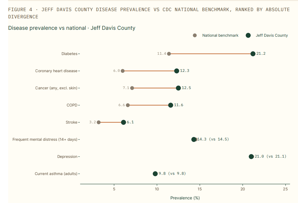
Jeff Davis County is the heat health risk leader nationally at 97.2. Population 1,856, median household income $63,614 (relatively high for a compound signal county), Provider Gap 99.2 (ranking in the 99.7th percentile nationally). The county sits in the Davis Mountains, hosts McDonald Observatory, and draws dark-sky tourism. It is also a structural provider desert with a population that is older, more chronically ill, and more heat-exposed than any Texas metro. The combination of “tourism economy with environmental amenities” and “compound health signal” is unusual and worth flagging for any CHNA covering this region.
For practitioners in this region, the implementation strategy implications are different again. Heat preparedness becomes a real consideration, not a checklist item. Cardiology and pulmonology access (covered in detail in the heat article) become service line questions rather than abstract gaps. The seasonal nature of risk matters: summer mortality patterns in these counties differ from East Texas in ways the standard CHNA framework does not always capture.
Region 4: The Panhandle
10 of 20 Panhandle counties (50%) carry the compound signal. We treat this region briefly because the pattern overlaps substantially with the Hill Country pattern (small populations, structural provider gap, elevated Social and Economic Stress, secondary disease burden) without distinctive regional drivers that warrant a separate narrative. The interesting Panhandle finding is the persistence: even with smaller compound signal scores than East Texas or the Hill Country, the Panhandle counties score consistently above national means on Provider Gap and Social and Economic Stress, and the regional pattern is more uniform than in any other Texas region.
For a CHNA practitioner serving the Panhandle, the implication is that regional collaborations across counties are more viable here than in regions with sharper county-by-county variation. Hub-and-spoke service line strategies, regional FQHC consortiums, and shared CHNA processes among small-hospital systems are all worth considering.
What the metro outliers say about Texas urban health
Most Texas big-metro counties do not carry the compound signal flag. Harris (Houston), Dallas, Travis (Austin), Bexar (San Antonio), Collin, Denton, Fort Bend, Williamson, and Montgomery all score in the 38 to 47 range on overall opportunity, well below the compound signal threshold.
Three metros do carry the flag, and they tell three different stories:
Tarrant County (Fort Worth, population 2.18 million) carries an Environmental Risk plus Provider Gap signal. The Environmental Risk score is 71.0, driven by ozone, traffic, and TRI release intensity in the urban core. The Provider Gap of 78.7 reflects a state-wide Texas pattern: even the largest metros run specialist density below national peers because Texas has a structural specialty supply gap that does not resolve at the metro scale. Tarrant is the surprise on this list, a 2.2 million-person urban county in a wealthy MSA still flagging on the compound signal.
El Paso County carries an Environmental Risk-driven signal at 70.0, anchored to the desert-southwest air quality and cross-border emission patterns of the Paso del Norte airshed. Provider Gap is moderate at 59.4, the lowest among the major Texas metros, because El Paso has a relatively consolidated health system footprint serving a constrained geography.
Hidalgo and Cameron, already discussed in the Rio Grande Valley section, are the third and fourth metro outliers.
The implication for major Texas metro CHNAs: the conventional “we are a metro, we have hospitals, the compound rural signal does not apply to us” framing misses Tarrant, El Paso, Hidalgo, and Cameron. Each represents 400,000 to 2.2 million residents in a county that scores like a compound signal area on at least two pillars. The metro CHNA conversations in Fort Worth, El Paso, McAllen, and Brownsville should be looking at this data even though Houston, Dallas, Austin, and San Antonio CHNAs largely do not need to.
Mortality validation: comparing Texas to Texas
The mortality framing in this article requires a different methodological move than the Mississippi or West Virginia roundups. Texas as a whole has lower mortality than the national average across most chronic conditions, because the metro Texas counties (representing more than half the state’s population) skew the state average down. Comparing Texas compound signal counties to the national mean would understate the within-Texas disparity.
The honest comparison is Texas signal counties versus Texas non-signal counties. Across CDC WONDER 2024 crude mortality rates per 100,000 population (the same field surfaced on every county profile page in the platform):
- All-cause mortality: signal counties average 1,416.3, non-signal Texas counties average 1,108.2 (+27.8%)
- Heart disease mortality: signal counties 312.6, non-signal 230.5 (+35.6%)
- Chronic lower respiratory disease mortality: signal counties 82.0, non-signal 53.6 (+53.0%)
- Stroke mortality: signal counties 67.7, non-signal 50.4 (+34.4%)
- Cancer mortality: signal counties 243.9, non-signal 197.5 (+23.5%)
These are crude single-year rates rather than age-adjusted multi-year aggregates. CDC WONDER suppresses small cells (fewer than 10 deaths), which drops some very-low-population counties from individual cause-of-death averages. The suppression affects both signal and non-signal cohorts roughly proportionally and does not bias the within-Texas comparison. A reader who looks up any individual signal county on banana-analytics.com will see the same underlying data behind these averages.
The within-Texas excess mortality in compound signal counties runs 24% to 53% across the major chronic conditions. The largest gap is in chronic lower respiratory disease, which aligns with the Provider Gap pattern: these counties have inadequate primary care for managing COPD and asthma over time, and inadequate specialty pulmonology supply when the disease progresses. We documented the pulmonology gap in detail in our heat health risk article; the within-Texas mortality data is the validation.
For CHNA preparation, the implication is direct: implementation strategies in the compound signal counties have to address chronic disease management at the population scale, not at the individual visit scale. The mortality gap is too large to close with referral pathways alone.
The behavioral health desert that should change the conversation
The most striking service line finding in the Texas data is psychiatry access. Of the 14 Texas counties scoring at or above 70 on the overall opportunity score (where higher scores indicate greater community-health need under our scoring methodology), 13 are at or below the national 25th percentile for psychiatrist density, and 6 of the 14 have zero psychiatrists registered with CMS at all. Of the 129 canonical compound signal counties, the picture is similar: psychiatry is the most consistently absent specialty.
This finding should change the implementation strategy conversation in two ways.
First, every CHNA covering a Texas compound signal county should be foregrounding behavioral health access as a primary strategic question, not a secondary one. The IRS Section 501(r)(3) requirement asks hospital facilities to identify “significant health needs.” Behavioral health access in these counties is a significant health need by any reasonable definition, and the data is concrete enough to support a well-defended implementation strategy citation.
Second, the standard responses (telepsychiatry partnerships, integrated behavioral health in primary care, school-based mental health services) all have credible evidence bases and all become more impactful in counties with structurally absent baseline access. Texas-specific organizations doing this work, including the Hogg Foundation for Mental Health, the Meadows Mental Health Policy Institute, and several FQHC networks, have implementation models that can be adapted at the county level.
A pulmonology overlay tells a similar story. Of the 14 highest-opportunity Texas counties, 11 are at or below the 25th percentile for pulmonologist density and 10 have zero pulmonologists. Combined with the within-Texas excess CLRD mortality documented in the previous section, the implication is that respiratory disease in these counties is essentially being managed (or not) through primary care alone, without specialist support. This is the structural reality behind the mortality numbers.
Where Texas systems are already focused, and where the data points elsewhere
A few Texas health systems publish detailed CHNAs that we can reference as data points.
Texas Health Resources released their 2025 CHNA in January 2026, identifying healthcare access and navigation, transportation, connectedness, and food insecurity as priority areas through 2028. The system covers 16 counties across North Texas. This is a defensible set of priorities for the THR service area, which sits primarily in metro counties with strong Provider Gap pressure but lower Disease Burden than the East Texas or Hill Country compound signal regions. THR’s framing aligns with what the data shows for their geography.
Baylor Scott & White built an internal Community Data Atlas to support their CHNA process. This is a credible response to the general problem of fragmented community health data, and it validates that mid-tier and large Texas systems are actively investing in community health intelligence tooling.
Houston Methodist’s CHNA explicitly cites compliance with both the Affordable Care Act and the State of Texas community benefit standard. Houston Methodist’s service area includes Harris County and several surrounding metro counties, none of which carry the compound signal, but the system’s CHNA discipline is exemplary.
University Health (Bexar County Hospital District) runs a longstanding CHNA collaboration with the Health Collaborative across Bexar County. This is a model for regional CHNA coordination across multiple institutions.
What the Banana Analytics data adds to these existing efforts is not a replacement for the work these systems are already doing. It is a structural overlay that surfaces three categories of missing context.
The first is the compound signal counties that fall outside major system service areas. Most of the East Texas Piney Woods, the Hill Country compound signal cluster, and the Panhandle are served by critical access hospitals and rural health clinics, not by the large nonprofit systems whose CHNAs receive press coverage. Those smaller institutions face the same 501(r)(3) obligation but with smaller analytical staffs. They are the audience for whom external community health intelligence tooling is not a luxury but a structural necessity.
The second is the metro outliers (Tarrant, El Paso, Hidalgo, Cameron) where the compound signal pattern means the standard metro CHNA framework needs adjustment. The current published CHNAs from systems serving these counties typically do not foreground compound exposure or convergent risk patterns at the level the data supports.
The third is behavioral health access. The published CHNAs we reviewed do mention mental health, but the structural absence of psychiatry in the compound signal counties (13 of 14 at or below the 25th percentile, 6 of 14 with zero) is more severe than the typical CHNA framing suggests.
For practitioners
The Texas compound signal data has direct implications for several different practitioner roles.
If you write CHNAs for Texas hospital facilities, the four-region framing in this article is a useful organizing structure for the secondary data review section of your assessment. The 129 compound signal counties are a defensible starting point for “significant health needs” identification under Section 501(r)(3), and the within-Texas mortality comparison (compound signal counties versus non-signal counties) is the most credible framing for the disparities discussion.
If you serve in a critical access hospital, rural health clinic, or FQHC in any of the four Texas compound signal regions, the implementation strategy implications are not the same as the metro CHNA conversations you may be reading from major systems. The drivers in your service area are dominated by Provider Gap and Social and Economic Stress, the chronic disease burden runs higher than state averages, and behavioral health access is structurally absent. Implementation strategies built around care navigation, telehealth specialty partnerships, FQHC capacity expansion, regional service line collaborations, and integrated behavioral health are the relevant categories.
If you work in a Texas health system community benefits or population health role, the Service Line Opportunities tab in the Banana Analytics platform surfaces cardiology, primary care, pulmonology, and psychiatry gaps for any cohort. The cohort can be a defined service area, an attribution file, or a drive-time isochrone. The combination of the compound signal scoring and the service line gap analysis is the structural argument for tele-cardiology, tele-psychiatry, and rural-urban hub-and-spoke investments.
If you run a Texas county or district public health department, the regional clustering data is a starting point for shared assessment processes across multiple counties. The Banana Analytics platform is free at the county level for the basic profile, includes the compound signal flag in the Compound Signals tab on Pro plans, and we make the platform available without a procurement conversation when the work warrants it.
For organizations conducting a Texas community health needs assessment in 2026 or 2027, the data is current as of May 2026 and includes CDC PLACES 2025, Census ACS 2024 5-year, CDC WONDER 2024 mortality, and refreshed provider density from CMS NPPES. The platform refreshes daily; the underlying pillar scores update on each release cycle.